David Hockney's major new exhibition opened a week or so ago at the Royal Academy in London. The public seem to love it but on the whole the London art critic's responses were less than positive. Many of them (not all) hated it.This really surprised me as David Hockney is one of my all time heroes -and whilst the criticisms may or may not be justified I felt confused by the damning remarks. Even Hockney's old art teacher now 85 said his show was 'rubbish'.
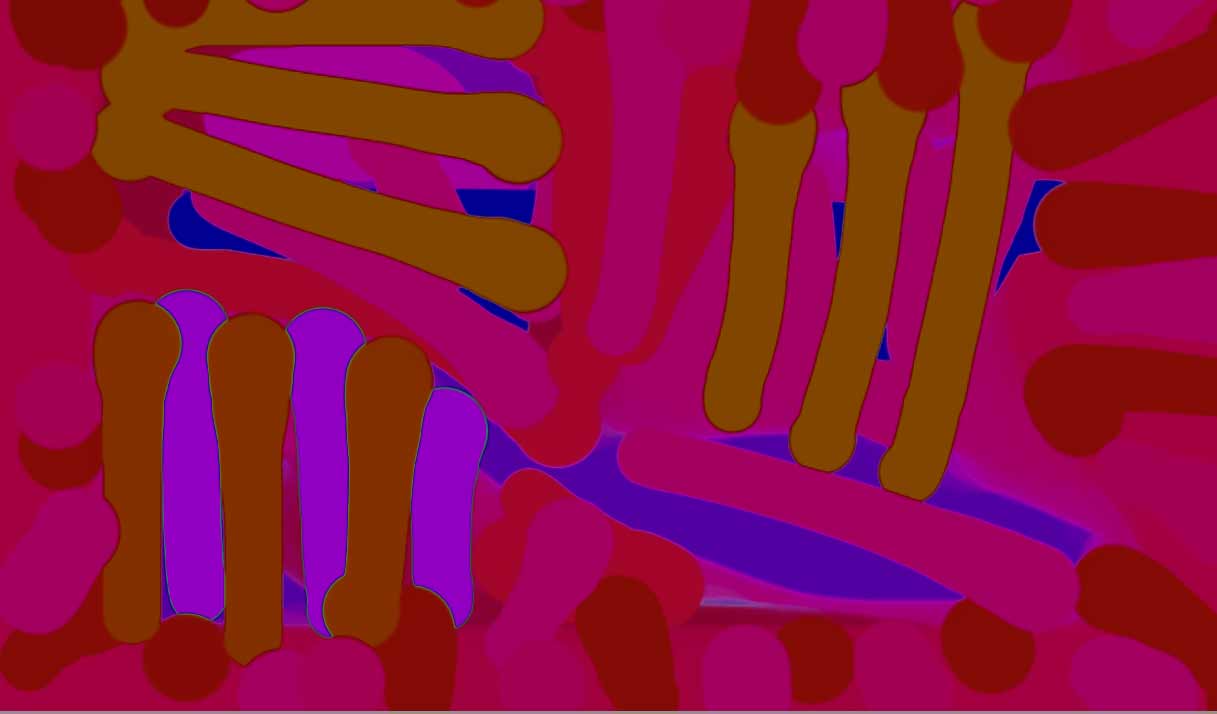
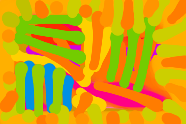
The main criticisms of his exhibition were along the lines that it's a barrage of colour, a strain on the eye, too many bright pictures crammed in and too many garish colours.
Matisse’s colour was often considered garish, violent and upsetting, the same goes for Van Gogh. It does not mean their paintings are bad, maybe they sometimes wanted to put colour together in a way that jars?
But there are problems for artists using lots of out of control bright colours, your eye can only take so much bright colour at once before it finds it unpleasant. I have a few thoughts I’d like to share about how an artist might avoid bright garish gaudy colour.
1.Don’t use lemon yellow (it’s really acidic)-if you do use it be careful not to dirty it with black for example.
2.If you use a lot of different colours, particularly complementaries, you have to leave areas of the painting free from this intense colour to rest the eye somewhere in the composition.The brighter the colours and the more variety, the larger the amount of space you need in a picture to rest the eye.
3.Keep it simple.
4.Avoid colour harmonies that are triadic.
http://www.tigercolor.com/color-lab/color-theory/color-harmonies.htm
- personally speaking I think this is the most ugly colour
harmony. Neither opposing colours or friendly colours.
5.Don’t have all the colours on full blast all over the picture, pull back and subdue a few so that the ones you want to stand out really have priority.
6.Proportion- some colours in terms of surface area should dominate over the other
colours in a picture. A larger amount of red than blue, or a larger amount of blue than red.
7.Don’t use too many different tubes of paint colour.
My own feeling is to use as few tube variations of a particular colour as possible. Intermix the paint from as few tubes as you need and there will be more harmony between the colour.
8.I really think yellow is a tricky colour, perhaps use one hue of yellow per picture.(eg.cadmium yellow, or yellow ochre).
Obviously this all sounds close to picture-making ‘rules’, I also think rules are made to be broken.
I welcome any other ideas/thoughts on this.