My Portrait for Bank of England of Governor Mark Carney unveiled

My Portrait for Bank of England of Governor Mark Carney unveiled

public.jpeg

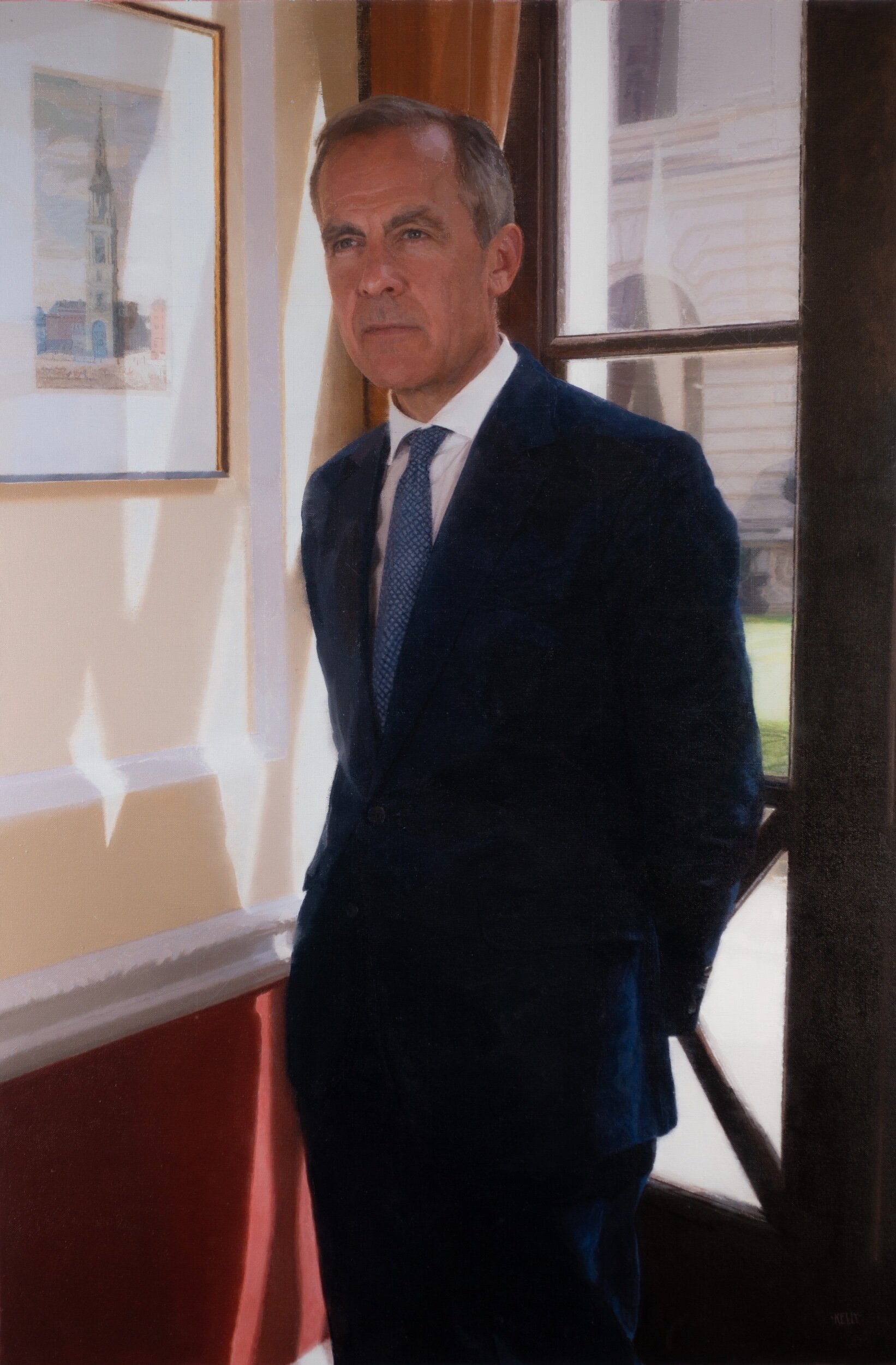
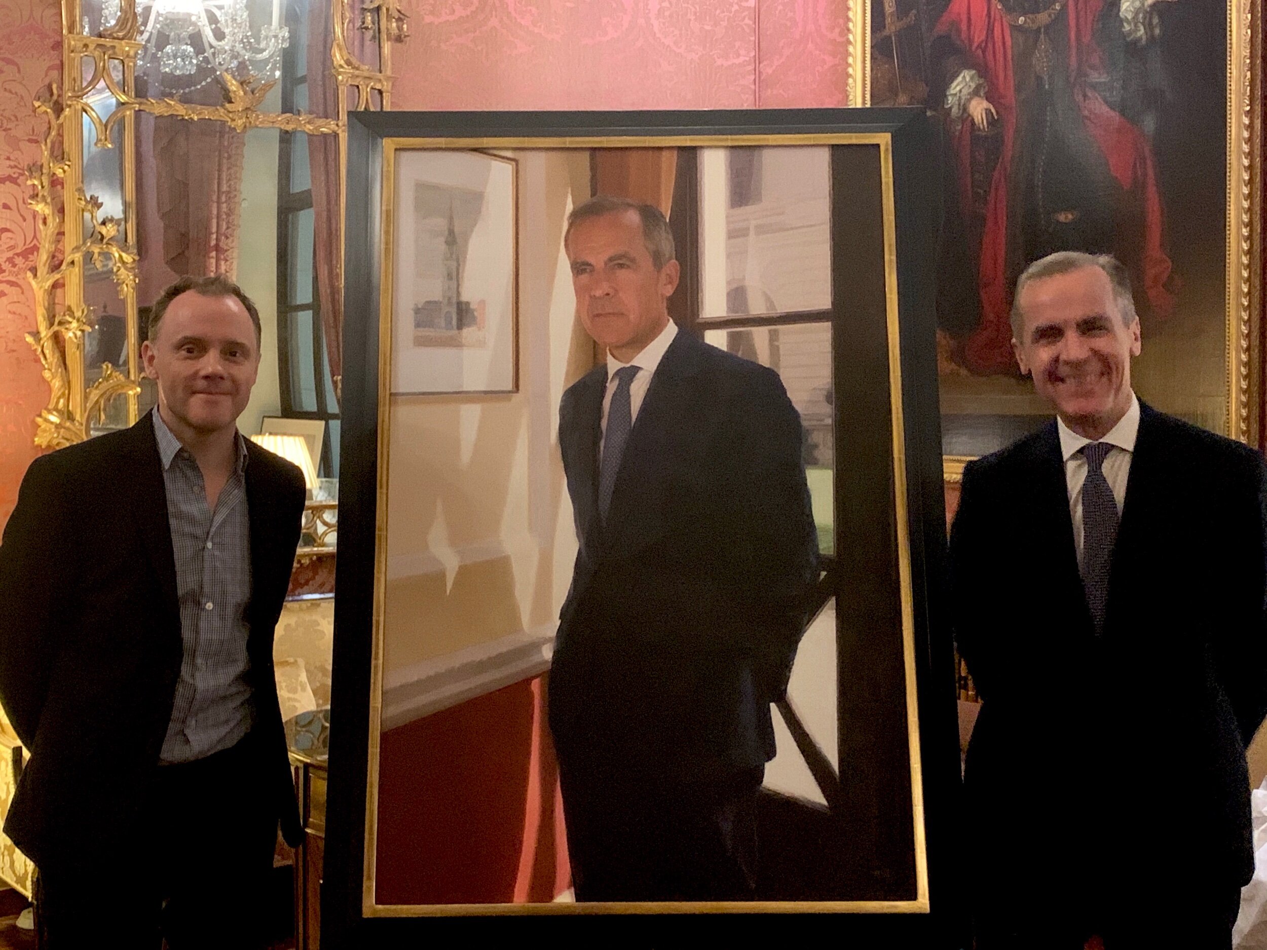
Earlier this week my portrait of Governor Mark Carney was unveiled at the Bank of England. Mark Carney has been Governor for 7 years at the Bank and he leaves office today to make way for his successor Andrew Bailey. Former Chancellor George Osborne described him as ‘the outstanding central banker of his generation”. Prior to being Governor of the Bank of England Mark Carney was Governor of the Bank of Canada, a position he took up after 13 years at the investment bank Goldman Sachs. This week, after cutting the interest rate, he gave a press conference with Andrew Bailey, saying that the economic shock from coronavirus would be large but ultimately temporary.

The painting will hang alongside the portraits of previous Governors of the Bank of England, in the central area of the Bank where the Governor and senior officials have their offices and meeting rooms. This grand part of the Bank is known as the Parlours.

The painting itself depicts Governor Mark Carney in his office, with the sunlight shining in. Aside from it being interesting to meet and get to know him a bit I found it a really interesting portrait to paint from a lighting point of view because in the various parts of the portrait the light bounces and reflects in all sorts of different ways. For example it shines on the grass and consequently bounces back up onto the building. This view out into the central garden of the bank seen through a window reflects part of the room inside and the back of the sitter on the glass surface. How to paint the strong blown out areas of light was also a challenge. I decided to render them softly although I had thought I might paint them more expressively at first. I avoided expressive painterly marks in this picture as I wanted the atmosphere to be more mellow and reflective. I aimed to strike a balance between the positive brightly lit atmosphere created by the light and the expression in the face which has warmth but has also a touch of sobriety.

public.jpeg

2 Artist’s Workshops in Madrid

2 Artist’s Workshops in Madrid

Just to let any artists out there know I’m teaching 2 very short art workshops later this year in Madrid.The courses are 2 days each and take place in mid-October 2019.

public.jpeg

The themes I will be talking about are ‘Simplification’ (within the context of producing figurative art) in course 1. In course 2 I will be investigating with the students the question of why artists might use photography or not when they make figurative art, this is a contentious subject with artists and the idea is to investigate the pros and cons in detail .Both courses are aimed at medium to advanced students.

These courses are €310 each and are hosted by ‘The Art Digger Lab’ and more information about the courses is on their website (https://www.theartdiggerlab.com/en/)

The Art Digger Lab hold short courses by a number of internationally recognised figurative artists and portrait painters.

The 2 themes I have chosen to concentrate on are both close to my heart.

Course 1 - The Power of Simplification: I wanted to discuss this because I think how to simplify is one of the most important skills for a figurative artist, and one of the most persistent stumbling blocks for those learning to paint.I have taught many artists to draw and paint over the years and even the best of them needed constant reminding that they needed to simplify what they were trying to depict before they could really get to the essence of their artwork.The interesting thing about simplifying is also that it can be an inroad to both representational painting and more expressive ways of painting.If one’s subject is complex for whatever reason being continually creative about how you simplify it whilst you create you picture, (I’ve found) is one of the fundamental steps to reach one’s artistic aim.

Course 2- The visual reference:working from photos, life and perception.I have chosen to look at this subject in the course because when I was at art college myself the teachers were very strict with us about not painting from photos.Consequently when I was younger I only painted from life, but over the years I began to use more photography as a reference in my work.I use photography for 90% of my references when I paint now and this works for me.But, over the years I have often wondered why exactly were my tutors at art college we’re so strict about not using photos?Were they right?I’m not totally sure they were right because both good and bad paintings get made from life and from using photos all the time.What this course will be examining in detail is ‘what are the pros and cons of either working from life, photography or even memory’ also questions like ‘ how does the experience of painting from life or photography effect the final work?’ and ‘if you do use photography is an exact copy from a photo better than using it as a memory aid?’

In both courses students will be drawing but the emphasis will be the learning of drawing methods that are specifically helpful to painting.

If you are an artist who is interested also in learning how I approach these topics and would like a short trip to Madrid later in the year to attend one or both of these workshops do contact https://www.theartdiggerlab.com/en/ and they can take it from there.I look forward to seeing you there!

Portrait of former CEO of Standard Life, David Nish unveiled

Portrait of former CEO of Standard Life, David Nish unveiled

Earlier this week a recently completed commission I painted of David Nish was unveiled at the head office of Standard Life in Edinburgh. David was the CEO of Standard Life from 2009-2015. Standard Life have a long history of having their CEO's portraits painted for their boardroom. Previous portraits were painted by some very famous scottish portrait painters, Sir James Gunn and Stephen Conroy to name a couple. It was a nice commission for me to take on, not only because my painting would hang in this well-established Scottish art collection, but also because I'm Scottish myself and orginally from Edinburgh. 

Detail of the final portrait of David Nish

Detail of the final portrait of David Nish

As I started the development process for the portrait I met David and we chatted about possible routes for the composition. I live and work in London, and not far from my studio is the building in the city of London known as the Gherkin. It's a very tall building and Standard Life have offices at the top. The view over the city of London is amazing and particularly dramatic at night. So I arranged a sitting with a fellow artist to stand-in for David and I came up with 2 possible compositions with a view over the city of London behind. I thought it could be quite a modern looking portrait.

First compositional study for Portrait of David Nish

First compositional study for Portrait of David Nish

Second compositional study for Portrait of David Nish

Second compositional study for Portrait of David Nish

At the same time as developing the 'city at night view' I also had a separate photo sitting with David Nish at my studio. The images in my studio were simpler and focused totally on the sitter with no eye-catching background. I'd describe those images more as character studies and the view over the city image as more of an interesting composition.

One picture stood out from the photo sittings in my studio, it was one you see in the image below on the right. It's very simple and direct.

I compared the 2 images side by side to the scale that the final portrait had to be (70cm x 90cm) and the simpler image on the right had more presence to me. I thought it could be more striking and David would be painted larger than life scale. This image had another advantage over the city view in that I felt I could bring drama to it by using large brushes when I painted it. There is not a lot of detail in it which meant I could concentrate on the brushwork. Broad, direct brushwork I hoped could also communicate or suggest David's sense of energy in the final painting.

So I had a vision of where I wanted to take the portrait, but it's not that simple to just take the idea and execute it on the canvas, I had to do some figuring out, I needed to find a way to bring energy, broad brushwork, drama, and realism to the canvas.

iPad sketch

iPad sketch

I started first by sketching the portrait on the iPad (Procreate app) to see if it would give me any ideas of how to bring movement to this photo in paint .

I then did a second small study on canvas. I was initially quite loose and rough with this and as I painted it there developed a sweep of movement in the bottom left of the portrait. This I realised could be the starting point for the overall movement in the picture. It was useful to do these little tests because as well as helping unlock interesting ways to paint the final image, it was even more helpful in terms of alerting me to what might be difficult or problematic in the final portrait. They allowed me to confront mistakes and problems without messing up the final painting. This was so useful as it provided me with a lot of insight in terms of how I might paint the final version.

I did some full scale simplified head studies too. These helped me understand the main planes and shapes of David's face prior to painting his head in the final portrait.

A lot of my preparatory work was spent visualising the painting as a whole .

On my mind were the following questions :

What would the general mood or feel of it be?

 How would I get all the colours and brushwork to work to communicate this feeling?

 How would the directions of various brush marks effect the movement over the whole image?

I wanted it to have drama and energy, but it also had to work within the context of quite a formal boardroom where it was to hang eventually. So you could say a lot of my time early on and mid way through was spent thinking about the fundamental issues of this portrait.

Just as important, was what I thought about towards the end of painting the final picture, and that was 'what could I suggest about David from a psychological point of view?'. The eyes were very important to this portrait , and the picture was painted in such a way as to make the eyes the sharpest and most prominent thing in the picture. A lot of the elements in this picture dissolve away, like the shoulder, the ear, the arm in the background. The dissolving of these elements allows me to paint these sections with dramatic brushwork, but the eyes are clear, steady and focused on the viewer. The eye nearest the viewer takes prominence over everything else in the picture.

The expression was interesting to paint as at one minute he looks contented and humorous , at another glance he has a directness and a seriousness.

The finished portrait of David Nish

The finished portrait of David Nish

The portrait was unveiled in the boardroom of Standard Life on 24th July 2017. Many of David's past colleagues were there as well as his and my family. The drama and energy I'd aimed for was  noted, interestingly his family mentioned the humour in the expression, former colleges the serious side.

I find it fascinating to watch how different people respond to portraits. Do they bring their own memories and thoughts when they interpret a face?

Myself and David Nish with his portrait at the unveiling

Myself and David Nish with his portrait at the unveiling

If you are interested in finding more about the story behind this portrait and how it was made you can watch the 10 minute video below.